The Great Ormond Street Hospital Children’s Charity has rebranded to make it more relevant and connect with potential donors and supporters more effectively.
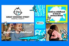
The charity has updated its logo and introduced blue as its “beacon colour” to provide greater accessibility, recognition and to stand out.
Gosh charity’s original logo was designed for its Wishing Well Appeal in 1987, with the teardrop face inspired by a young patient’s drawing.
The updated design retains most of the original logo’s features and introduces elements for a “digitally native identity system”.
Gosh said its updated design also improved accessibility and legibility across print and digital channels.
The blue used for the teardrop in the charity’s logo will be present across the brand’s design system.
Gosh charity’s rebrand incorporates new animal illustrations inspired by the ward names at the hospital.
The rebrand process, which was started in 2022, cost about £150,000, which a spokesperson said was equal to less than 0.3 per cent of the charity’s annual income.
The charity said the illustrations were “unique to the charity’s brand identity” and “represent the collective efforts of the ‘doers’ who are transforming the lives of children under the hospital’s care”.
It said: “When animated they give a sense of movement and togetherness as well as representing the fun and playful spirit at the heart of the brand’s renewed focus on childhood.
“The ability to animate the animal characters as well as the new font and pen stroke has been a key consideration throughout the project, as the charity looks to create greater impact on digital channels.”
The charity said by improving legibility and accessibility with its rebrand, it was putting children’s lived experiences “front and centre”.
Around 3,500 stakeholders – patients, families, Gosh staff, charity employees, donors, corporate partners and members of the public – were involved in the rebrand.
Emma Guise, director of marketing and communications at Gosh, said: “The world has changed enormously in recent years, and we hadn’t updated our brand since 2017.
“Our refreshed identity, designed to be more accessible, inclusive, and digitally enabled, symbolises the progress we’re driving for seriously ill children and underscores the collective role we all play in realising it.
“We hope the refreshed brand will empower us to be more relevant and inspire our current and new audiences to get involved.”
– This story was updated on 25 June 2024 to include details about the cost of the rebrand and how long it took.